
ESMA Logo Design
- Nov 27, 2017
- 1 min read
Date: 11/22/17
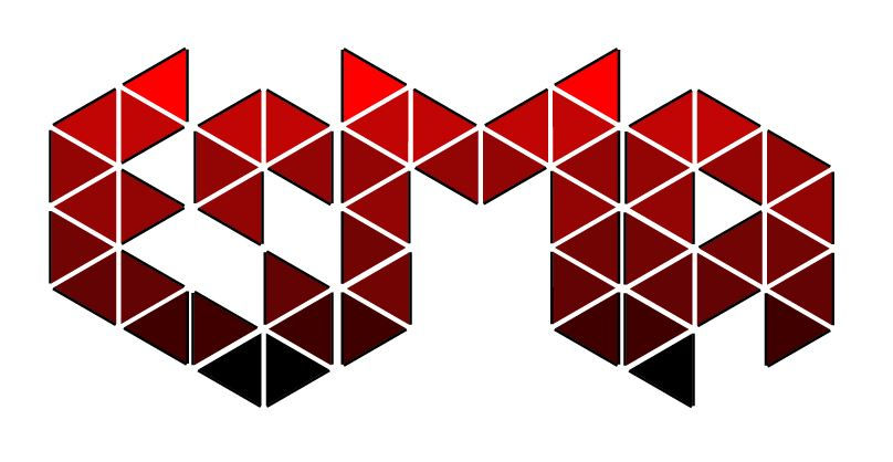
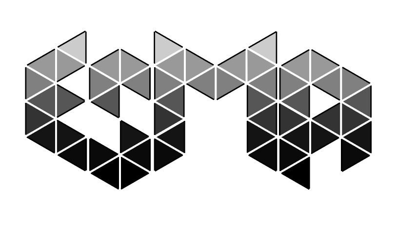
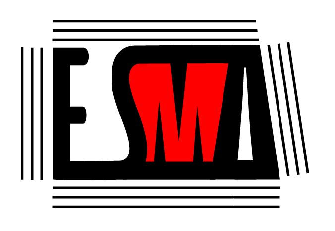
What is a ligature logo? A ligature logo is when two or more letters are connected together. A Logo is usually the name of a company in a design that is unique to the company. Many companies use ligature logos so audiences have something to remember about the company
How would describe the corporate identity of ESMA in 5 words?
Red, Black, Bold, musical, diverse
Which logo out of the two do you feel is the strongest and why?
I feel like the second one may be stronger because it is easy to read, but I like the first logo better.
If you had no requirements or restrictions how would your logo look different?
I'm not really sure what I would do. The designs we were allowed to do were very open and we were able to really create with this project.
Explain which ligature techniques you have demonstrated on each logo:
I have demonstrated using shared strokes for my first two logos and reverse the field for my second logo.


Comments