
Starbucks cup design
- Jan 8, 2018
- 1 min read


Date: 12/21/17
How do you believe your design relates to the corporate Identity of your company?
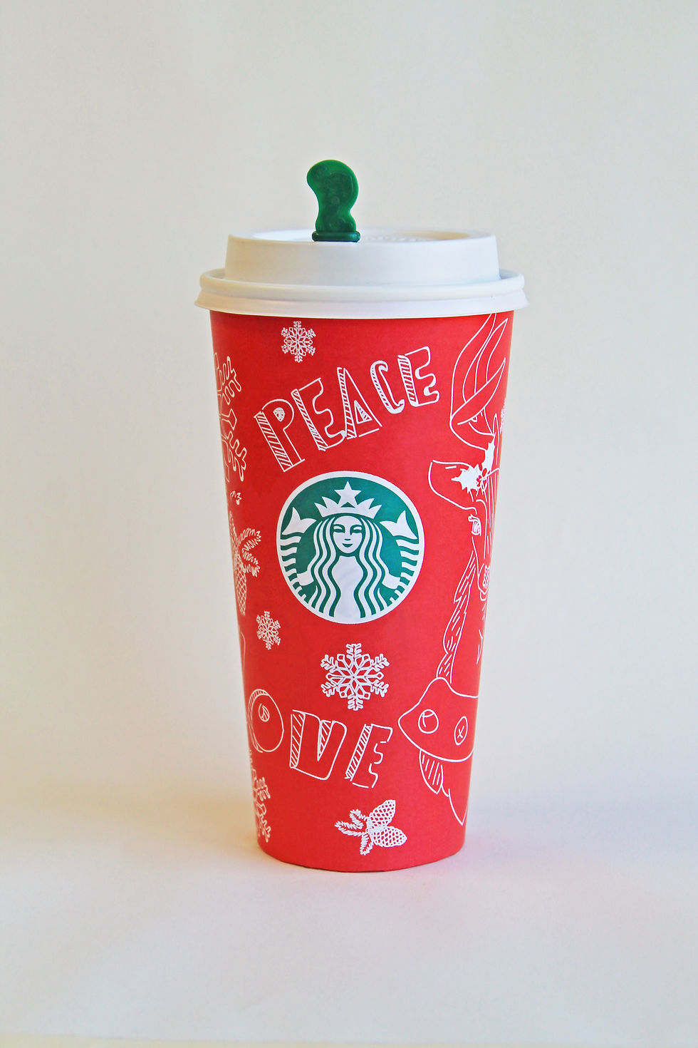
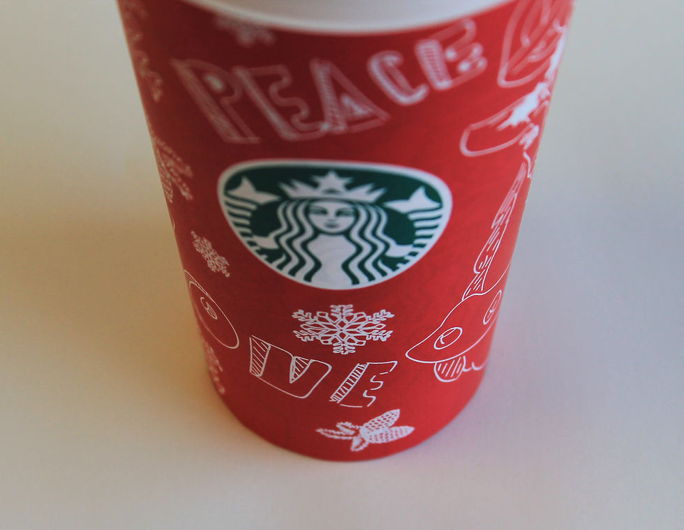
I believe my design relates to the corporate identity of Starbucks because I used the logo in the cup and many of their previous holiday cups have been red and white with winter themes drawings and items. I also added the Starbucks trademark on the side and the drink customization boxes.
How does your cup portray the “holiday”?
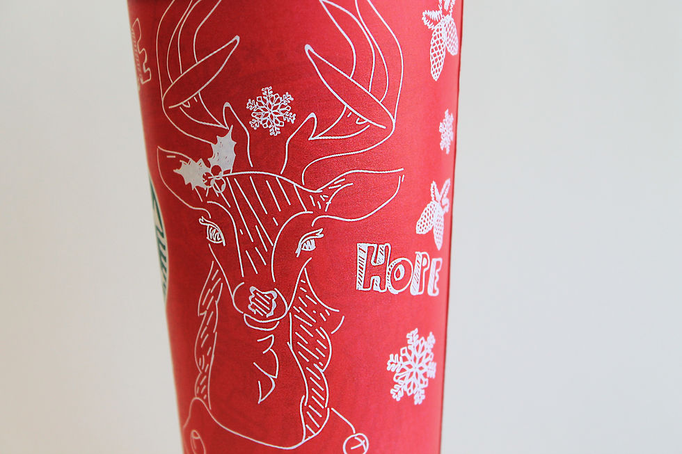
I drew items such as a reindeer with mistletoe above its ear, pine cones, snowflakes, along with words such as “peace”, “love” and “hope”.
Do you think that the company you designed for would really use your cup?Why or why not?
I would hope that they would use my cup because I really tried to give it the “doodle” effect and I tried to be as precise as I could with the drawings I made.
What makes your Cup Unique and Different?
Everything on my cup is hand drawn. I drew the words and my teacher even thought I used a font for them, so I believe the words came out really well, and I really like the deer that I drew on the cup.
Describe the process in which you took to create the cup? (From beginning to end)
I didn’t really do much with the cup except use the paintbrush tool and give the cup a red background. I did change the stroke to .25 because 1 was too big for the detail I wanted in the cup.


Comments